Dark Mode version of the Raise Me iOS app
-
 Mariah Gonzales
- 8 months ago
- 1 min read
Check out another insight from the people building the tool helping students realize their college ambitions.
In our second post for Building Raise Me, we learn from Jason Branch, a Senior Product Designer at Raise Me, who walks through the best principles for creating the dark mode version of your iOS app. By now you’ve seen a dark mode feature on your favorite app whether it be Twitter or YouTube. Referencing Apple’s User Interface guidelines and Google’s material design system Jason shows off the steps taken to create Raise Me’s new look and feel.
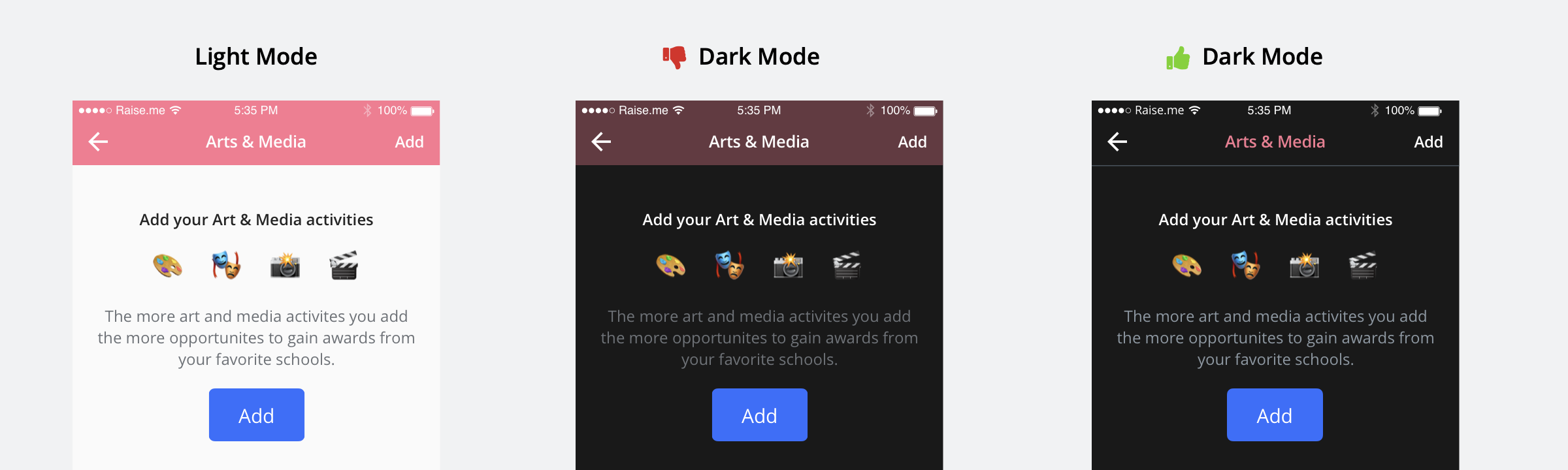 iOS designs in both light and dark mode.
‘Building Raise Me‘ is the Raise Me Design & Engineering blog! We’re starting to tell the stories behind the decisions that go into making the Raise Me product, features, and community. Here we’ll discuss technologies we use, challenges we face, the research we’re doing and how our ideas go from sketch to implementation.
Want to learn more about working at Raise Me? Check out our jobs page.
Mariah Gonzales
First and foremost, Mariah really loves snacks. She also loves people. She is a Teach for America alum turned ed-tech People Operations Manager with a side hustle co-leading Raise Me’s Diversity, Equity, and Inclusion strategy & programming.
You may also like
Our commitment to racial justice: a statement from Raise Me’s Co-Founder and CEO
Racism, police brutality, and violence have no place in our society. Read more about our commitment to eradicating racial...
Get Inspired: Celebrating Artists for Asian Pacific Islander Desi American History Month
Get inspired by these artists for Asian Pacific Islander Desi American History Month!
 Samantha Schulte
Celebrating Asian American and Pacific Islander Heritage Month
Raise Me is taking a step back during the month of May to explore and celebrate the diverse experiences amongst Asian American and Pacific Islanders.