
We’ve changed up the look and feel of Raise Me, and we hope you love it.
Notice anything different about Raise Me lately? That’s because we’ve rolled out our new logo—and we couldn’t be more excited to share it with you!
Starting today, you’ll not only see the new logo make its appearance throughout our website, our blog, and across all our social media channels— you’ll also notice that we’ve modified the look of our written name as well. We’re excited to share some of the thinking behind our new visual identity with our community.
OUR NEW LOGO
Raise Me was created to empower each and every student with the opportunity to build their path to higher education and beyond. Since launching nationally in 2014, we’re proud of the impact we’ve made—from serving students in 1 of every 2 high schools nationwide in their path toward college discovery, to helping some 750,000 students earn scholarships from colleges for their individual achievements throughout high school.
Our team took a hard look at our vision, mission and impact in our aim to develop a symbol that reflects our continued goals of making college a more tangible, accessible, and definite reality for all students. With that in mind, we set out to create an inclusive logo that would not only hold true as we scale the breadth of whom we empower, but also reflect just how much we’ve matured as a company since our inception. And thus, the new Raise Me logo was born:
Our new logo serves as a visual representation of the consistency, simplicity, and longevity of Raise Me’s student platform, and is grounded in some of the foundational qualities of our brand and our community: inspiration, approachability, simplicity, helpfulness and truth. The icon itself evokes the visual of a sun rising above two peaks—echoing our belief that when individuals are given the opportunity for success, they will rise to the occasion. Another interpretation of the logo is a person reading to further their education. In addition to the illustrative interpretations, the shapes in the icon are also arranged in such a way that they form an R and an M for Raise Me. We understand that while students are capable of achieving much on their own, they sometimes need a helping hand; the overlapping shapes in our logo represent the support we provide to help empower those on our platform. The multiple shades of color within the logo represent how there are many different ways individuals can attain success. With this new logo, we’re looking toward the future and embracing our commitment to create powerful tools that individuals can use to achieve the futures they envision.
DROPPING THE “DOT”
Raise Me began its journey as a college preparedness platform with the name “Raise.me”. From “raise-dot -me” to “raise-me” to “raise-dot-M-E”, what ensued was a range of pronunciations of our name, with a lack of clarity on the “correct” way. Starting today, that all changes. We’ve dropped the “dot” in our name to become Raise Me (prounounced “Raise Me”) — and you’ll see our webpage, web apps, social channels, and offline communities reflect this with a new written wordmark.
Months ago, we began this process to define a visual identity that was more long-lasting, more memorable, and more approachable. As Raise Me prepares to bring more students along a journey to build unique pathways to higher education, we’re excited to introduce a refreshed look and feel that simultaneously embraces Raise Me’s history and marks a new era in our existence.
Have questions? Want to tell us what you think? Give us a shout at support@raise.me.
Rachel Schmitz is a Senior Product Designer at Raise Me. In her free time, she enjoys befriending the office dogs, making music, and nerding out on film history.
You may also like
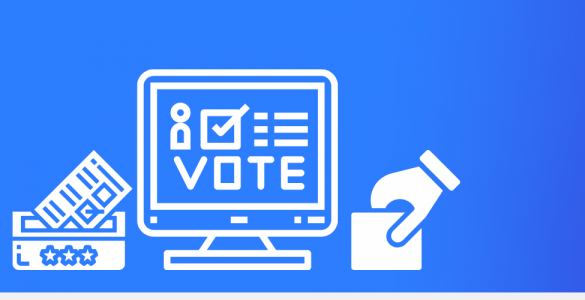
Students — Earn Micro-scholarships For Taking Civic Action This Election
This fall, more than 80 colleges and universities on Raise Me are offering micro-scholarships to community college and high school students for civic engagement activities like promoting voter turnout and advocacy.
 Cecilia Xia

New York Community College Students Gain Early Access To Transfer Scholarships on Raise Me
New transfer success initiative will reward students with financial aid awards for strong academic performance, and on-time degree completion from The College of Saint Rose, Concordia College New York, Rensselaer...
Our commitment to racial justice: a statement from Raise Me’s Co-Founder and CEO
Racism, police brutality, and violence have no place in our society. Read more about our commitment to eradicating racial...